Quiz Effectiveness Matrix at AcademyOcean
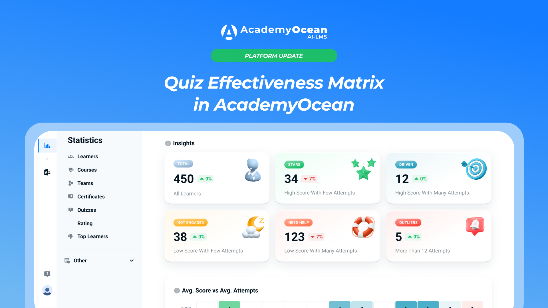
Quiz Effectiveness Matrix in AcademyOcean
Two learners can achieve the same quiz result while spending a different number of attempts on it.
The first one answered the questions correctly right away. The second one needed several retakes to earn the same score.
If you look only at the score, this difference remains invisible. The number of attempts, however, helps you understand the situation better: who completes tasks confidently, who persistently works through mistakes, and who may need additional help.
The quiz effectiveness matrix is already available in AcademyOcean. It compares learners' average score with their average number of attempts and displays the data as a heat map.

On a single page, the administrator sees the overall picture, opens the category they need, and moves on to the list of specific learners.
Why an average score alone is not enough
The average score shows how successfully a learner completed the task. The number of attempts explains how many times they returned to the quiz before reaching that result.
A high score after the first or second attempt and the same score after several retakes are two different learning scenarios.
In the first case, the learner handled the task quickly. In the second, they reached the required result but spent more effort on it.
A low score also needs to be considered together with the number of attempts. If a learner took the quiz once and never returned to it, it is worth checking their engagement. If they keep retaking it but the score does not improve, the reason may be the difficulty of the material, unclear question wording, or a lack of support.
The matrix shows these differences without the need to manually compare data from several reports.
Where to find the effectiveness matrix
The Effectiveness page is located in the Statistics & Reports section.

It brings together the Insights block, the Avg Score vs Avg Attempts heat map, filters, and data export tools.
Results can be filtered:
- by date;
- by quiz completion date;
- by learner registration date;
- by team, course, or quiz;
- by system and custom variables.

Filters help you move from a general academy report to a specific question. For example, check the results of an individual team, analyze a particular course, or find difficulties in a specific quiz.
The page can be exported to PDF for the selected period. Such a report can be saved or shared with colleagues who do not work directly in the academy.

How to read the heat map
The Avg Score vs Avg Attempts heat map compares two metrics.
The vertical Avg Score axis shows a learner's average result across all completed quizzes. The scale covers values from 0% to 100% in 10% increments.

The horizontal Avg Attempts axis shows the average number of attempts in completed quizzes. The scale displays values from one to six attempts, as well as a separate 6+ group.
Each cell of the map contains the number of learners with the corresponding combination of score and number of attempts. Clicking a cell opens a table of those learners.
This way, the team sees not a single averaged metric but the different scenarios of how quizzes are taken.
Five learner categories
The matrix divides learners into five categories. Each category takes into account the average score and the average number of attempts.
Stars
Stars are learners with an average score from 71% to 100% who needed one or two attempts on average.
They achieve high results without numerous retakes. On the matrix, this category is located in the upper-left green zone.
The category helps you find learners who show a high result and complete tasks confidently at the same time.
Driven
Driven are learners with an average score from 71% to 100% who needed three to six attempts on average.
They also achieve high results but return to quizzes more often. On the heat map, this category is located in the upper-right blue zone.
This segment helps you see persistent learners and check which topics or questions require several retakes.
Not Engaged
Not Engaged are learners with an average score from 0% to 70% who needed one or two attempts on average.
A low score combined with a small number of attempts may indicate insufficient engagement. For example, the learner did not return to the quiz after the first unsuccessful attempt.
This category is located in the lower-left yellow zone.
At the same time, the status does not explain the reason automatically. Before drawing a conclusion, you need to consider the context of the learning program and the circumstances of the specific learner.
Need Help
Need Help are learners with an average score from 0% to 70% who needed three to six attempts on average.
They retake quizzes but do not yet reach a high result. This may indicate that the material requires additional explanation or that the learner needs an instructor's help.
On the matrix, this category is located in the lower-right red zone.
Outliers
Outliers are learners with an average of 6+ attempts, regardless of the result they achieved.
This is a separate zone at the far right of the heat map. It helps you find atypical cases that require a more detailed analysis.
A large number of attempts does not explain the reason by itself. It may be related to the difficulty of the material, the wording of the questions, or the learner's individual circumstances.
Below the heat map, there is an explanation of the rules by which all categories are defined.
Insights: the overall picture in six cards

Above the heat map, there is an Insights block with six clickable cards:
- Total — the total number of learners;
- Stars;
- Driven;
- Not Engaged;
- Need Help;
- Outliers.
Each card shows the number of learners in the corresponding category and the percentage change compared with the previous selected period.
This helps you track not only the current distribution of learners but also how it changes over time.
For example, if the number of learners in the Need Help category has grown, the team immediately sees which segment needs attention. This is exactly where a more detailed analysis can begin.
A change in a metric does not explain the reason, but it indicates which data is worth checking.
Clicking a card opens a modal window with a table of learners from the corresponding category.
From the overall picture to specific learners
The learner table can be opened in two ways: through a card in the Insights block or through an individual cell of the heat map.

A card shows all learners in a certain category. A cell provides a more precise slice based on a specific combination of average score and number of attempts.
The modal window also has a Recommendations button. Each category comes with its own tip on how to work with these learners next.
For example, learners in the Stars category can be offered more challenging tasks or the next level of the program. For learners in the Need Help category, it is worth reviewing the learning materials, the quiz questions, and the need for additional explanation.
Recommendations do not replace the decision of an L&D specialist or an instructor. They suggest a possible next step that needs to be aligned with the goals of the learning program and the situation of a specific team.

The learner table can be exported to CSV and Excel.
How to use the matrix in your work
The effectiveness matrix helps you move from general metrics to specific actions.
An L&D team can filter a particular quiz and check where learners needed the most attempts. An instructor can open the Need Help category, review the list of learners, and identify who needs additional explanation.
An analyst can compare the distribution of learners across different periods, teams, or courses. However, a difference in metrics should not be immediately attributed to a single cause. The matrix shows a signal that needs to be verified together with other data.
For example, a large number of learners in the Need Help category may indicate not only the difficulty of the topic but also poor wording in the quiz itself. And growth in the Not Engaged category does not always mean a loss of motivation — learners may not have had enough time for a retake.
The effectiveness matrix is already available in AcademyOcean
Now the team sees not only the average quiz score but also the number of attempts learners needed.
The matrix combines these metrics in a single visual report. The administrator moves from a general category to specific learners, gets recommendations, and exports the data they need.
L&D and HR teams get more context for their further work: whom to offer more challenging tasks, whom to help with the material, and where to check for possible issues in the learning program.